Gig Economy Mobile App:
Reframing Features Into the Right Problem
How I turned three feature requests into a systemic solution for student availability accuracy in a two-sided marketplace.
The Brief
A gig economy platform connects customers with student workers (called "Hands") for various jobs. The app was already built and in market. The client approached us with a clear request: build three specific features, including a schedule input that would let students manage their availability directly in the app.
The brief was scoped to two weeks and included three features: the schedule/availability system, a minimum hourly rate display for both Hands and customers, and the ability to add multiple people to a single job. As the sole designer on the project, I was responsible for the full UX process and final handoff screens for all three, working within the app's existing design system.
This case study focuses on the availability feature, which I'm most proud of because of how the process unfolded. Rather than jumping straight into building the requested features, I took a step back to examine whether those features were solving the right problem.
Reversed Ideation: Working Backward From the Solution
I used a process I call reversed ideation. Instead of starting from the problem and working toward a solution, I started from the client's proposed solution (a student schedule feature) and worked backward: what problem does this solve? Is that the real problem? Are there adjacent problems this solution misses?
The app has two user types, and both needed to be examined:
People who hire Hands for jobs.
College students who get hired to do the work.
The client's proposed schedule feature addressed one narrow scenario: students could input their class schedules so customers would know when they were available. But when I mapped the full job request lifecycle, from a customer posting a job to a Hand completing it, a much larger problem emerged.
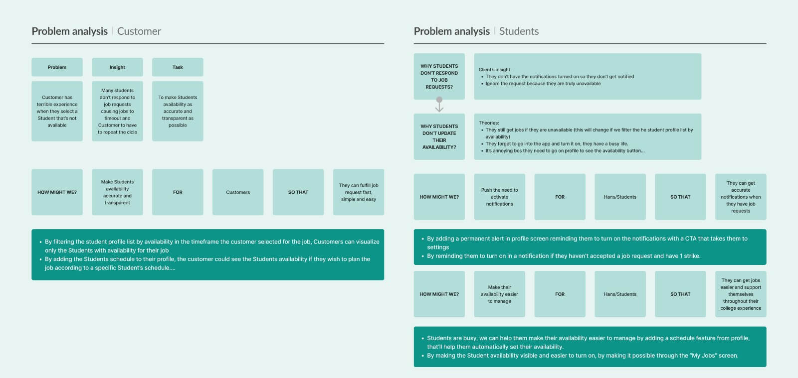
The Real Problem: Student Availability Accuracy
The core problem was that student availability in the app was inaccurate.
Customers selected unavailable Hands, waited 3 hours for the request to time out, then started over. The schedule feature alone wouldn't fix this because it only addressed one of several reasons availability was unreliable.
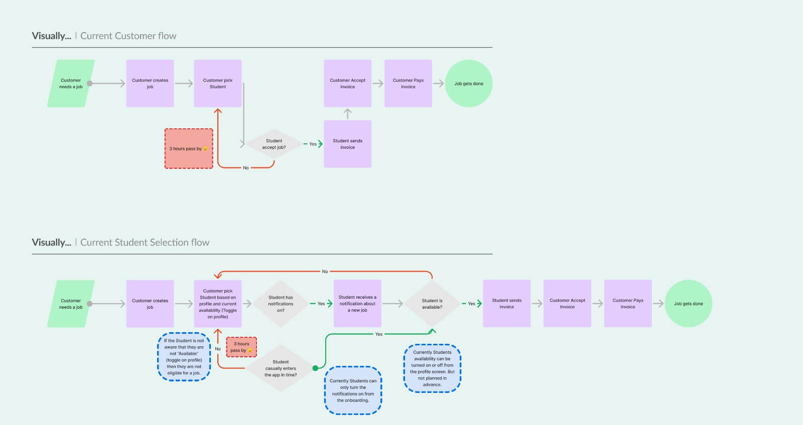
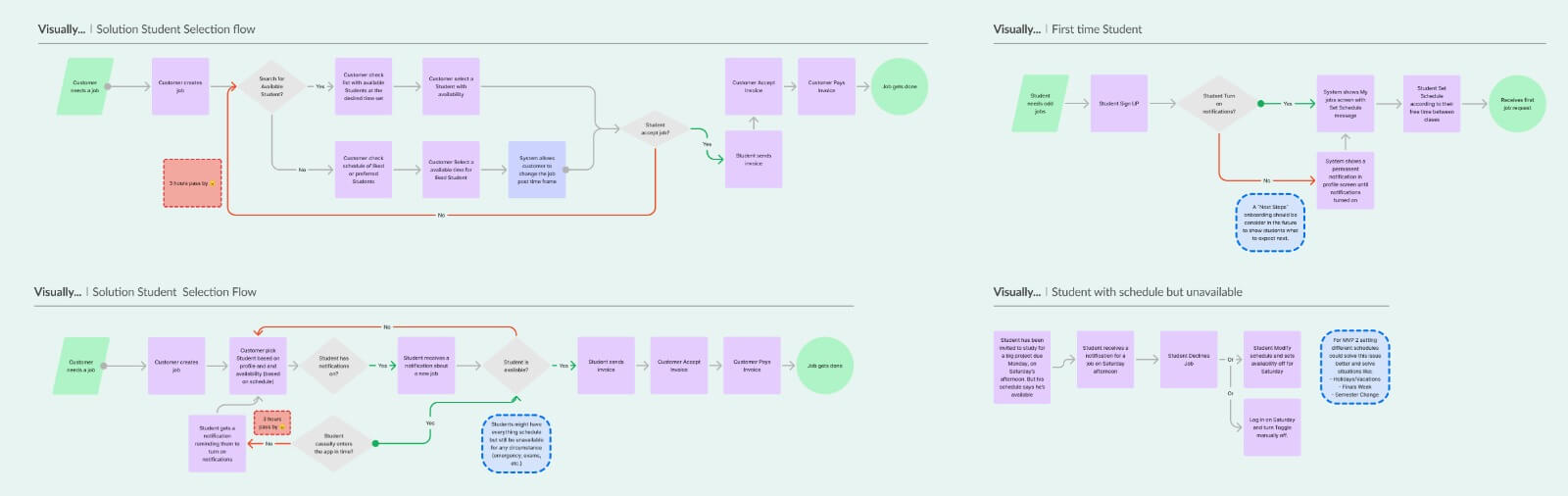
I mapped the problem from both sides using "How Might We" framing and flow diagrams, and identified why the system was breaking down:
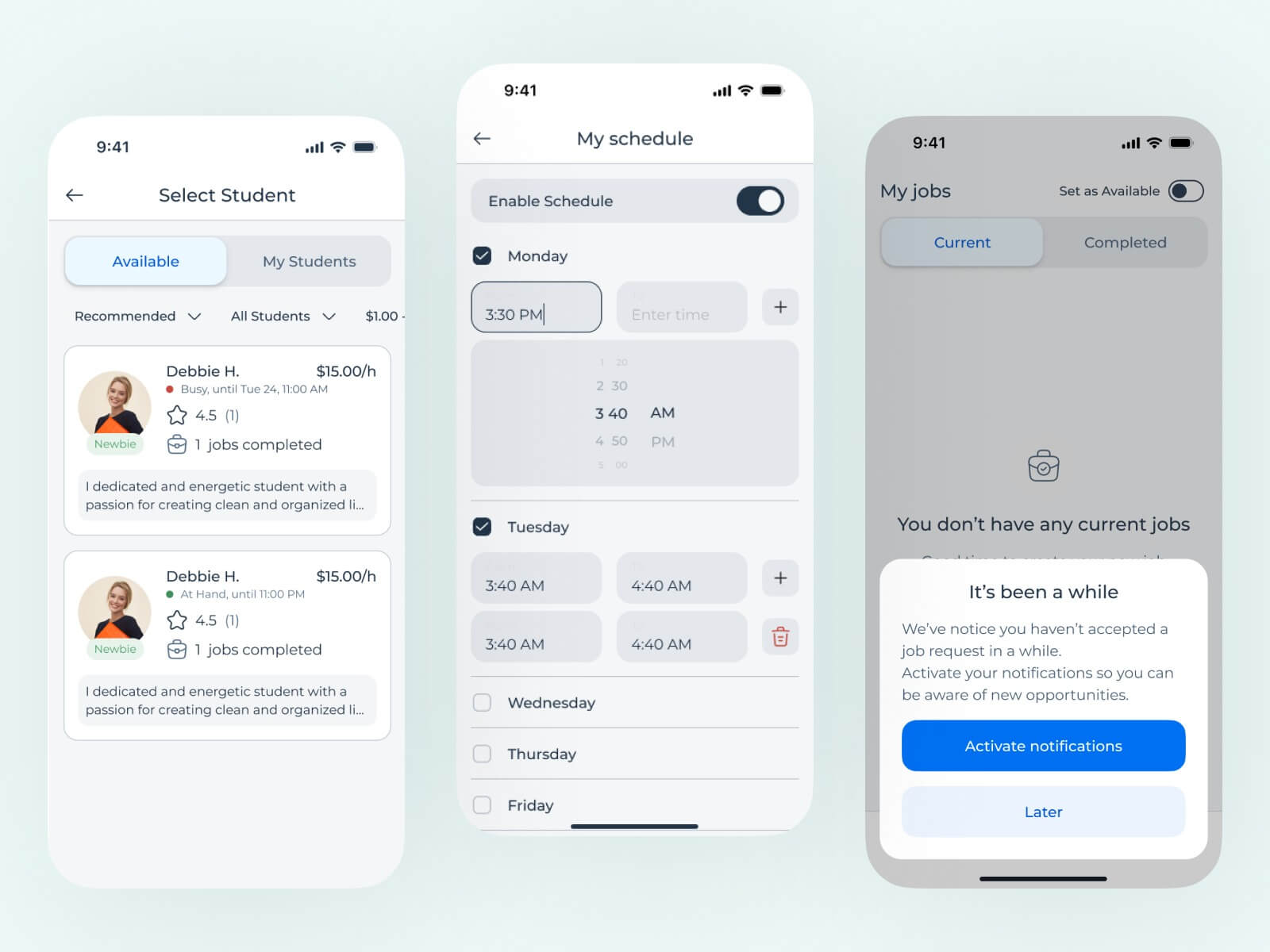
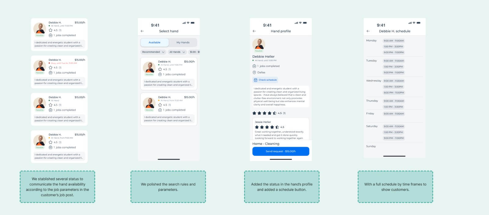
The selection screen showed all Hands regardless of availability. There was no way to tell if someone was available, busy, or offline before sending a request. Customers were essentially guessing, and guessing wrong meant a three-hour penalty.
Students may have had notifications turned off (a scenario that couldn't be fully confirmed but needed to be addressed). The availability toggle was buried in the profile screen, disconnected from their daily workflow.
I validated each of these assumptions step by step with the client, using flow diagrams that showed the current experience versus the proposed solution. Where my understanding was off, the client corrected me. By the time I was proposing solutions, we had built the analysis together and the client was already aligned.
A Holistic Solution
The client's original request (a schedule feature) was a valid piece of the puzzle, but only one piece. Solving the availability accuracy problem required attacking it from multiple angles simultaneously.
For CustomersFilter by Availability
Search results only show Hands available during the customer's requested timeframe. The highest-impact single change.
Status Indicators
Available/Busy/Unavailable labels on profile cards. Especially critical for "favorited" Hands who might not be available.
Schedule Visibility
"Check Schedule" button on profiles so customers can plan jobs around a preferred Hand's availability.
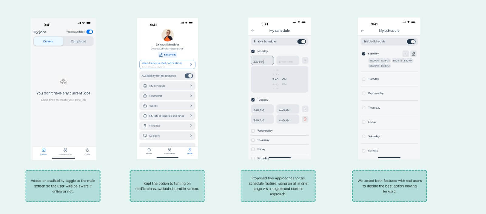
Schedule Input
The original feature request. Two approaches tested: all-in-one page vs. segmented day-by-day control.
Toggle on My Jobs
Moved the availability toggle from the buried profile to the primary "My Jobs" screen. Zero-navigation action.
Notification Reminders
Persistent reminders to enable notifications, not just during onboarding. Low-friction opportunities throughout the app.
The Problem Analysis
To communicate the reframe to the client, I produced a comprehensive problem analysis document that mapped the full picture:
Problem/Insight/Task Matrices
For both customer and student user types, connecting each pain point to its root cause and design goal.
How Might We Statements
For customers: accurate, transparent availability. For students: easier availability management.
Current vs. Solution Flows
Four scenarios mapped: current and proposed flows for both customer selection and student availability.
This document was the primary artifact that brought the client along. Because I built the analysis collaboratively, validating assumptions and correcting misunderstandings as we went, the solutions felt co-owned rather than imposed.
Validation
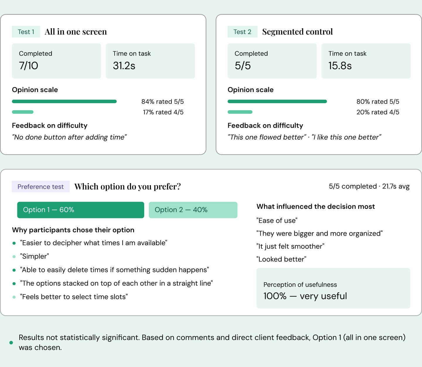
Within the two-week timeline, I conducted a small-scale test with users recruited by the client, comparing two schedule approaches: an all-in-one page versus a segmented day-by-day control.
The remaining solutions (filters, status indicators, notification reminders, toggle relocation) were validated through the problem analysis and client alignment process.
What I Delivered
This was a two-week engagement. There are no post-launch metrics to report, because I transitioned to another project after delivering the design work. What I delivered in those two weeks:
Complete Problem Analysis
Reframed 3 feature requests into a systemic marketplace problem with flow diagrams, HMW statements, and solution mapping.
6 Interconnected Solutions
Three customer-facing and three student-facing changes addressing the root cause from multiple angles.
Tested Prototypes
Schedule feature validated through user testing with a clear winning direction.
Final Handoff Screens
All solutions built within the existing design system, ready for development.
"Marian is very highly skilled in UI/UX. She has already thought through every scenario before hopping on a call with us and comes with solutions every call. She is super passionate about what she does and makes us feel like we are her only customer."
Co-founder, client company
Reflection
This project crystallized something I believe strongly about working with clients and stakeholders: people often jump to solutions early by asking for specific features, but as designers, we need to keep sight of what the real problem is.
The client came to us asking for three features. One of them, the schedule input, was valid. But it would have been a partial fix for a problem that was actually systemic. Students weren't just missing jobs because they lacked a schedule tool. They were missing jobs because the entire availability ecosystem was broken: notifications were hard to enable, the availability toggle was buried, search results showed unavailable people, and there was no visual signal to help customers make informed choices.
A big problem rarely has one big solution. It has many small solutions that, working together, close the gaps from every angle. The schedule feature was one of those solutions. The availability filters, the status indicators, the notification reminders, and the toggle relocation were the others. None of them alone would have fixed the three-hour timeout problem. Together, they addressed it from both sides of the marketplace.
The two-week constraint was also instructive. I didn't have months for discovery. The reversed ideation process, starting from the proposed solution and working backward to the problem, gave me a structured way to challenge the brief quickly and thoroughly without a lengthy research phase. It's a method I've continued to use when time is short and the stakes are high.
The most valuable deliverable from this project wasn't a screen or a prototype. It was the problem analysis itself: a shared, visual artifact that changed how the client understood their own product.