Performance Management Platform:
Partner Feedback Module
How I reframed a "build a form" brief into a friction-reduction strategy that pushed partner participation from 30% to 69%.
The Brief
A professional services firm operates a multi-module performance assessment platform. Throughout the year, partners complete activities across several modules (self-appraisals, goal tracking, leadership assessments) and the aggregate results determine their annual bonuses after a February review.
One critical input to that review had never been digitized: peer feedback. Every year, managers gathered partner-to-partner feedback manually through spreadsheets and email chains, then folded the results into their review conversations. The process worked, but barely. Participation had stalled at 30%.
The client wanted a dedicated module that would handle the full feedback lifecycle digitally and push participation to 60%.
The question wasn't "how do we build a feedback form?"
It was "how do we get busy professionals to voluntarily do something that doesn't benefit them, inside a system they may not want to log into?"
Understanding the Problem
I was the sole designer on this project, working alongside a development team and PM. This was the first new module I was building for this platform, which meant I didn't just need to design the feature. I needed to establish the foundational UX structure: process timelines, user types and their jobs for each screen, and a clear brief that mapped the offline workflow into a digital one.
Key constraint: The platform handles highly confidential performance data. I had no direct access to the live system and no ability to interview end users myself. User research was conducted by stakeholders who relayed findings to me.
Using stakeholder research and historical process data, I identified three friction layers blocking participation:
No Incentive to Act
Peer feedback didn't affect the respondent's own review or bonus. Partners saw it as optional, because functionally, it was.
Login Friction
Partners interacted with the platform infrequently. Many couldn't remember credentials, and the password reset flow was its own deterrent.
No Momentum (Hypothesis)
Based on offline process patterns, I hypothesized partners would complete one or two reviews and then disengage. This remained an assumption until tested.
Strategy
Rather than treating this as a single feature, I designed it as a multi-layered friction-reduction strategy, attacking the participation problem from several angles simultaneously.
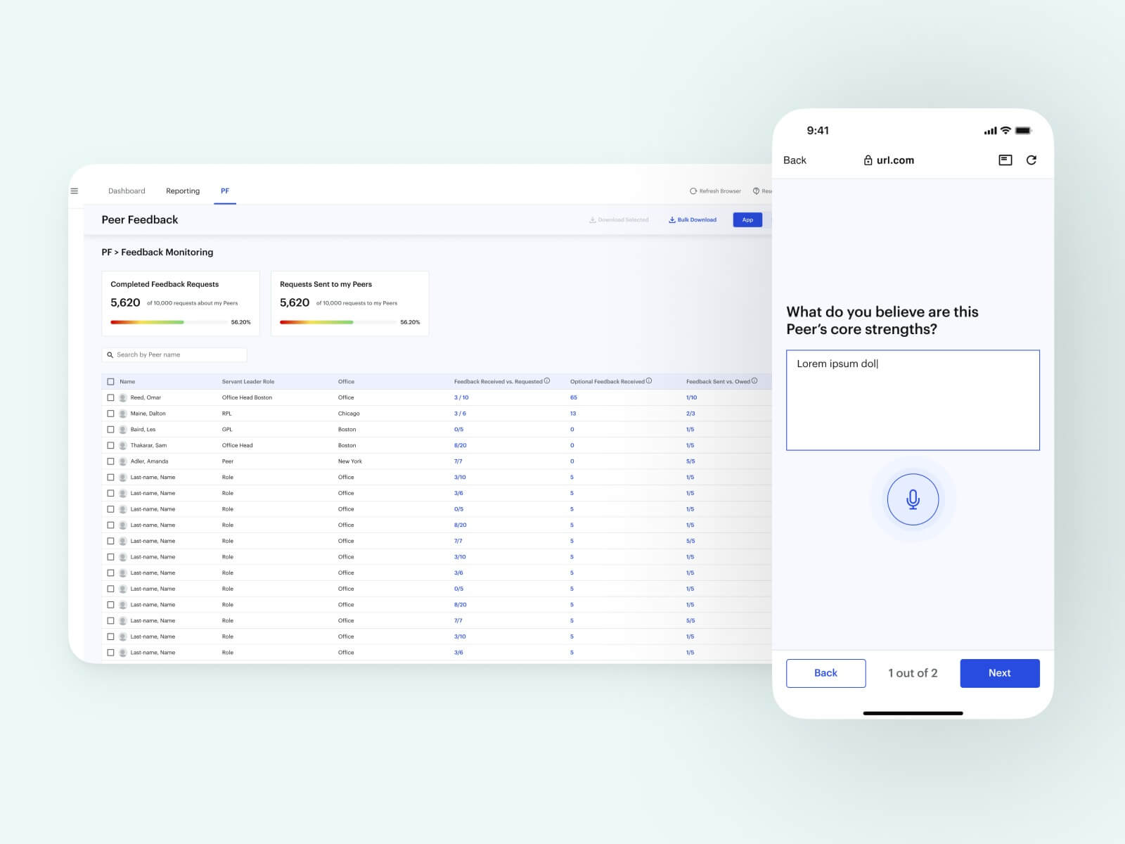
Integrated shortcuts into modules partners already used (self-appraisal, dashboard). If you were already in the system for something that affected your bonus, the feedback request was one tap away.
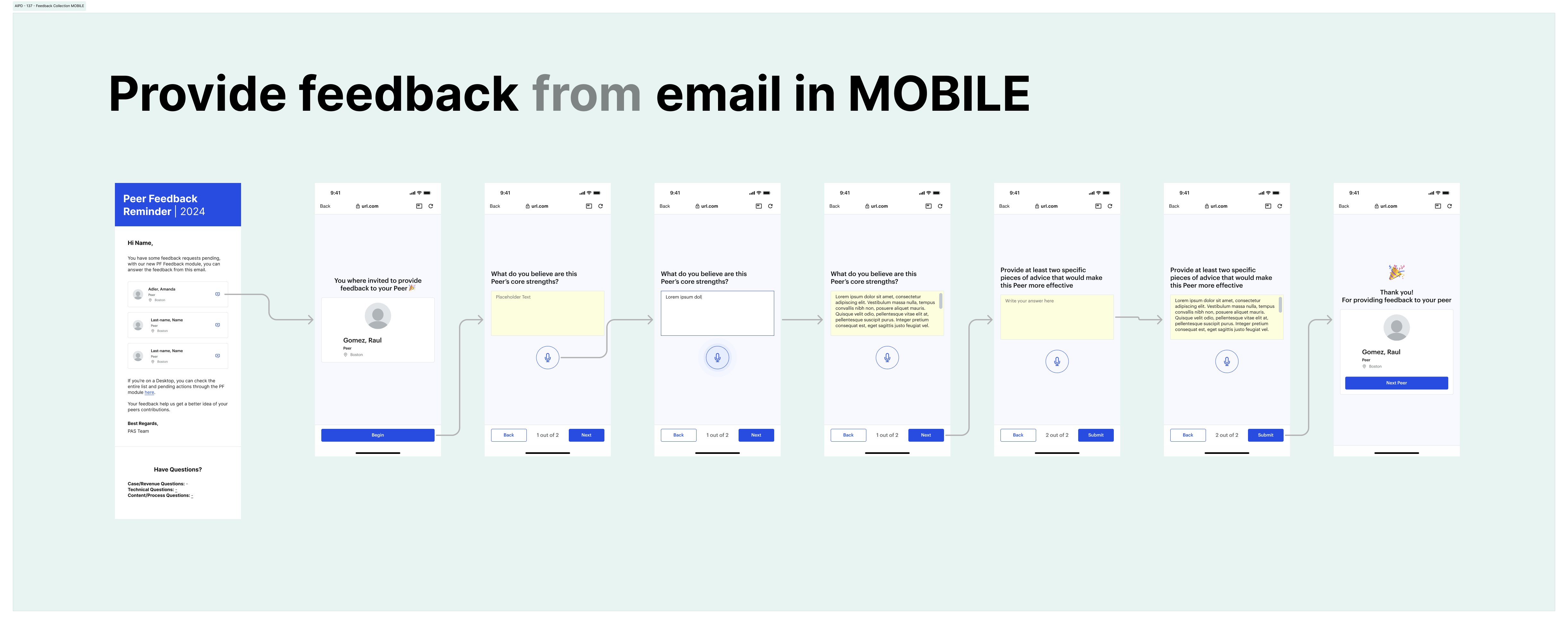
Mobile-optimized flow via secure, single-use email links. No login required. Each link scoped to one partner-reviewer pair with an expiration window. Designed for the "push" scenario when managers needed to nudge participation.
Auto-advance flow: submitting one review immediately surfaces the next. No return to dashboard, no task selection. Designed to address the drop-off hypothesis.
The Three Phases
The module spans the full feedback lifecycle across three months:
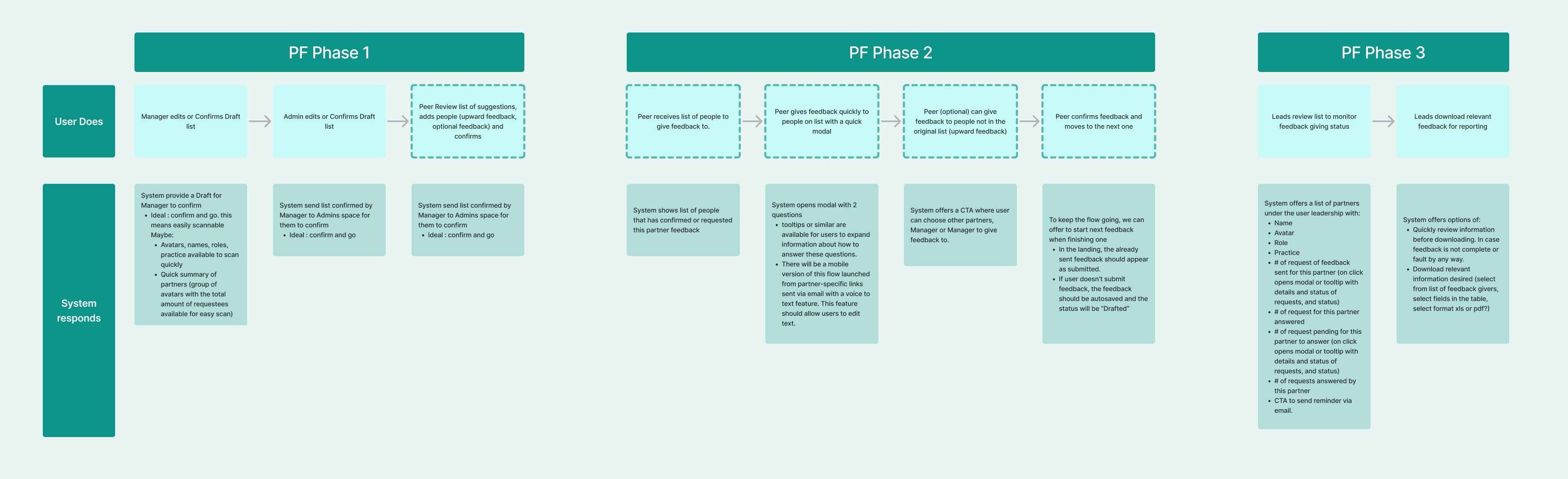
Phase 1: List Confirmation
OctoberThe system pulls data from previous year records and workforce management to generate suggested feedback candidates. Admins and managers refine the list: approve directly or send to partners for review. Digitized weeks of email back-and-forth.
Phase 2: Providing Feedback
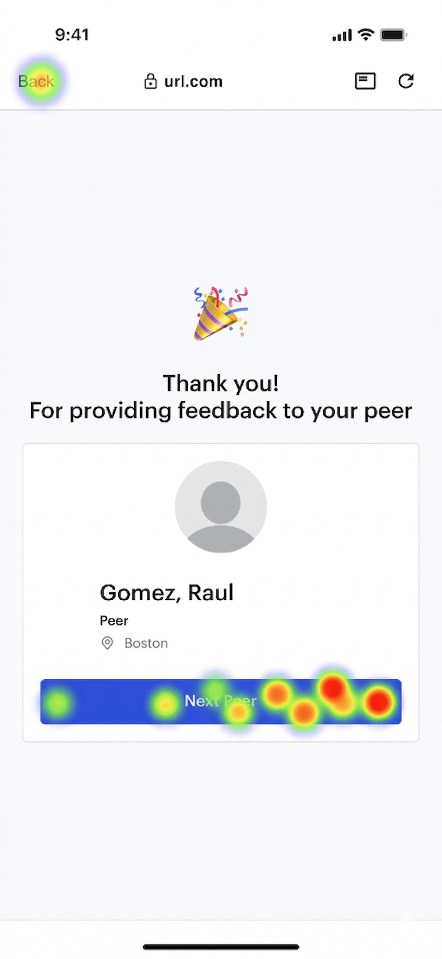
NovemberPartners receive their finalized list. Each submission is just two questions, kept deliberately short. Partners can also provide unsolicited feedback on leaders. Managers monitor participation in real-time and trigger reminders via single-use email links.
Phase 3: Preparing for Review
FebruaryManagers download collected feedback and integrate it into the review module. Feedback that was scattered across inboxes and spreadsheets now lives in a structured, searchable, downloadable format.
Design Decisions Under Pressure
The auto-advance flow, where submitting one review immediately surfaces the next, generated the most client pushback. The concern was that it might feel aggressive, as if the system was pressuring partners rather than inviting them.
I argued that the alternative, returning partners to a list and asking them to choose their next review, was exactly where the previous process lost them. The friction of re-engaging with a dashboard, scanning a list, and making a selection was enough to trigger abandonment.
User submits feedback, returns to dashboard, selects next review manually. Participants stopped after one or two.
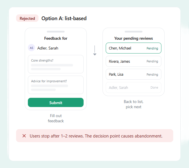
User submits feedback, next pending review surfaces immediately. Participants completed all pending reviews in a single sitting.
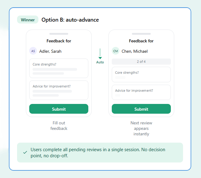
I prototyped both flows and presented them side by side. The auto-advance version showed a clear completion advantage. The client came around.
Validation
Before the October 2025 launch, I designed unmoderated usability tests and preference tests that stakeholders administered to a subset of partners. Because I had no direct access to end users, I built the test protocols and scripts, and stakeholders executed them and reported the findings back to me.
Single-use links didn't raise trust concerns. Participants noted they felt more secure than a shared login.
Two-question format: most participants completed a review in under two minutes.
Preference tests validated auto-advance over list-based, confirming the momentum hypothesis.
Results
Beyond the participation number, the module transformed a fragmented manual workflow into a structured digital ecosystem. Leadership now had a single source of truth for peer feedback, searchable, downloadable, and integrated directly into the annual review process.
Reflection
This project reinforced something I come back to often: a well-framed problem is worth more than a well-designed screen.
The client came to us asking for a digital feedback form. If I had built exactly what was requested, a login-based web form inside the existing platform, participation might have improved marginally, but the core behavioral barriers would have remained. The reframe from "build a form" to "eliminate every reason not to participate" changed the entire design direction.
The biggest constraint was also the biggest lesson. I had no direct access to end users and couldn't observe the live system. This forced me to invest heavily in information architecture and systems mapping upfront, documenting every user type, every process timeline, every screen-level job, so that my design decisions were grounded in structure even when I couldn't validate them through direct observation.
If I could redo this project, I would challenge the brief further during discovery. I focused heavily on the peer's side of the experience because their pain points and jobs were easier for me to understand and empathize with. The manager persona, with its more complex monitoring, list management, and review preparation workflows, received less attention during the initial design phase. After launch, we identified additional opportunities for manager-facing features that would have strengthened the module if they had been scoped earlier. In future projects, I would invest more time upfront in understanding the more complex user type, even when the simpler one feels more urgent.
The auto-advance flow, the decision I had to advocate hardest for, turned out to be one of the strongest drivers of completion. It also validated my initial hypothesis about momentum. That reminder stuck with me: assumptions are worth naming explicitly, because when they're confirmed, they become your strongest evidence.